
We’d love to hear from you!
Whether you have a project in mind, or just want to say hi.
Whether you have a project in mind, or just want to say hi.
info@foundbrandlab.com
Get in touch

The California Charter Schools Association launched the “We Are Charter Schools” campaign during a politically charged period in Los Angeles and across the state. Following a significant LAUSD board power shift and amid legislative debate over charter regulation, the campaign sought to clarify the role and purpose of charter schools in public education.
As external creative support, I translated the approved strategy and messaging into a cohesive visual system deployed across multiple platforms.
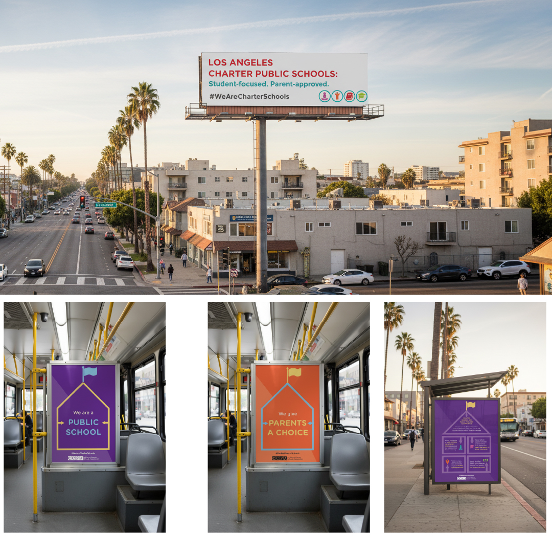
The campaign unfolded amid public scrutiny, legal sensitivities, layered stakeholder approvals, and compressed timelines tied to legislative cycles. Materials needed to inform without inflaming, reinforce credibility without defensiveness, and remain consistent across outdoor, print, and digital placements.

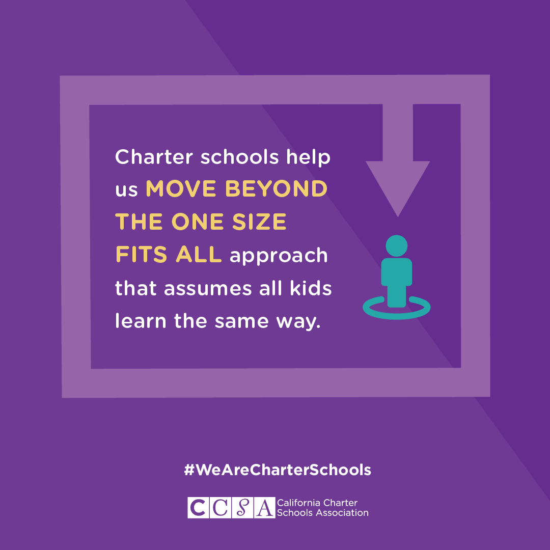
Public education sits at the intersection of policy, community trust, and lived experience. In moments of public debate, communications shape not only perception but participation. This campaign required visual discipline that could hold complexity without amplifying division, ensuring that public-facing materials clarified purpose, reinforced credibility, and supported informed engagement.
Grounded in CCSA’s mission to expand access to high-quality public charter schools and advocate for educational equity, the work required interpretation as much as execution. My role was to listen carefully, translate defined campaign goals into a focused creative brief, and build a clear, composed visual framework that could carry the message across formats.
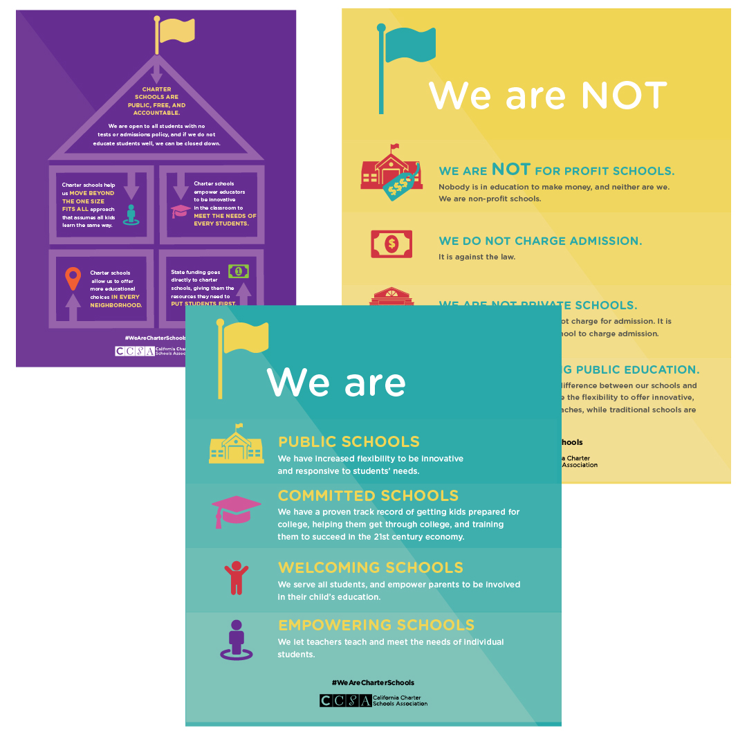
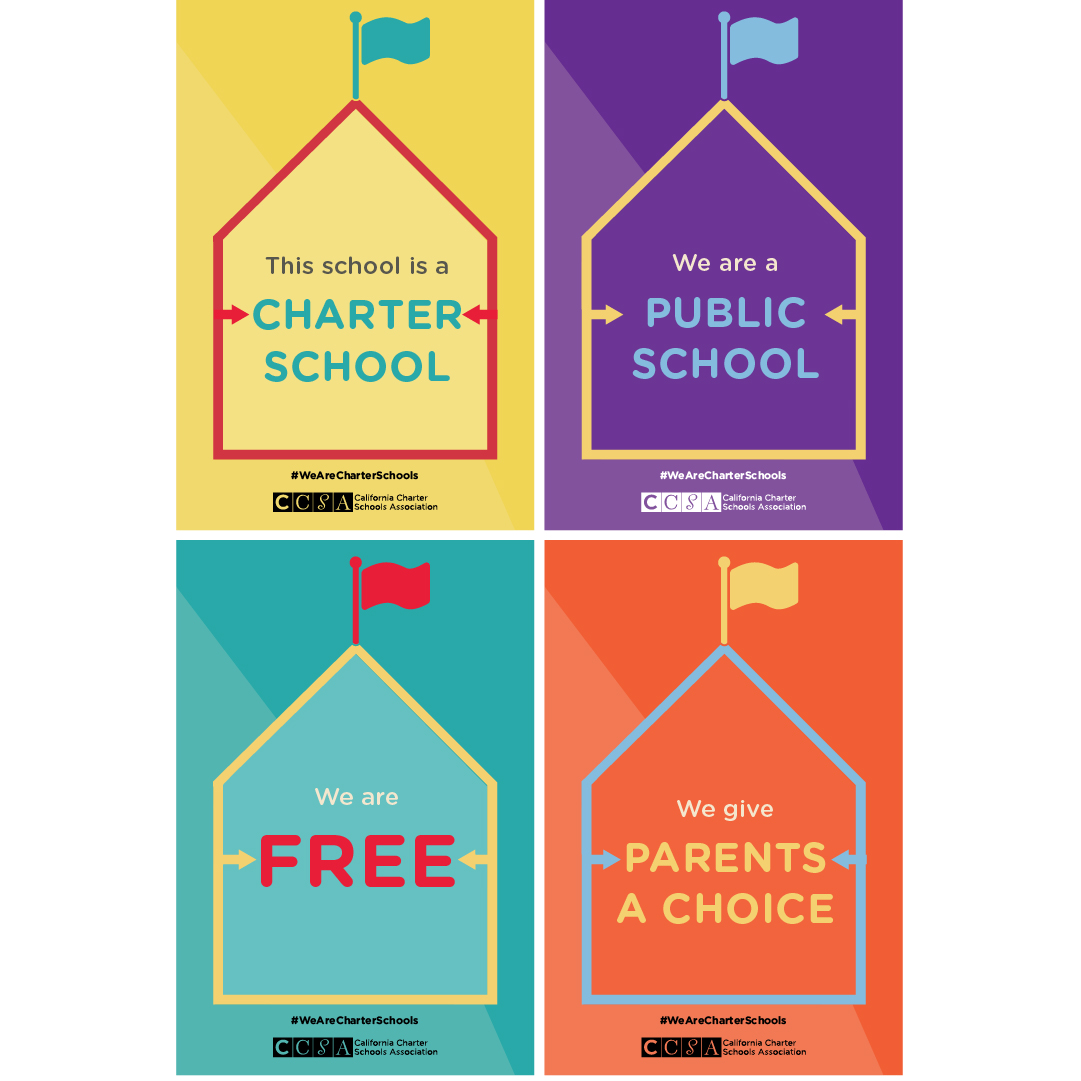
The design language emphasized:
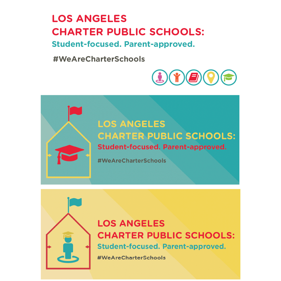
Each asset needed to stand on its own while contributing to a unified presence across billboards, social media, informational materials, and press-ready formats.
The campaign functioned as a coordinated system. A single, bold headline anchored each execution, with supporting copy segmented into concise, readable statements. Hierarchy controlled pacing. Scale directed attention.
All materials were produced within an accelerated cycle aligned to advocacy milestones.
The coordinated system of billboards, social media, and community-facing materials advanced the campaign’s central objective: clarifying the role of charter schools in public education during a period of heightened debate.
Together, these deliverables translated approved strategy into visible, accessible communications that supported public education and reinforced a confident, education-centered pro-charter perspective.